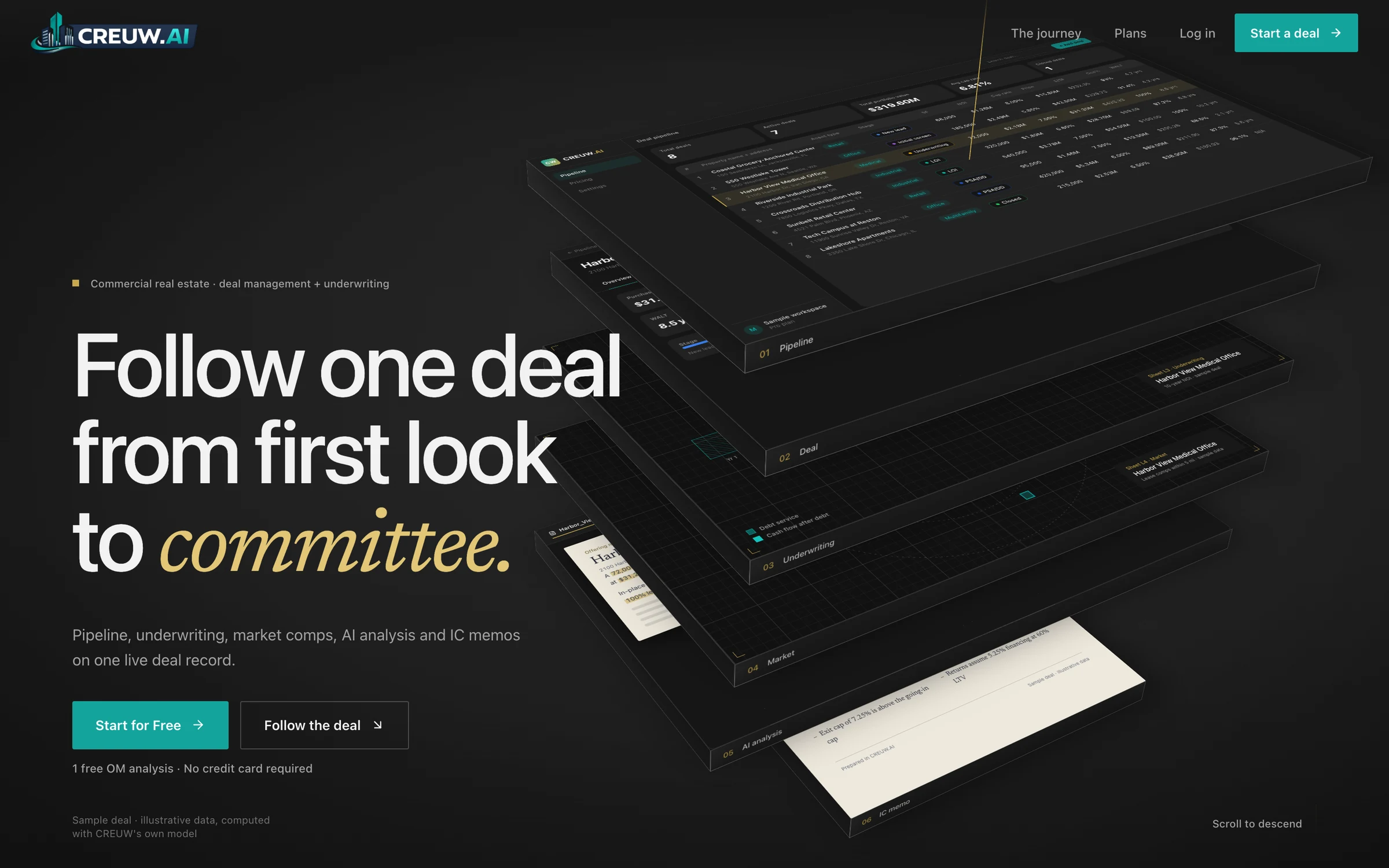
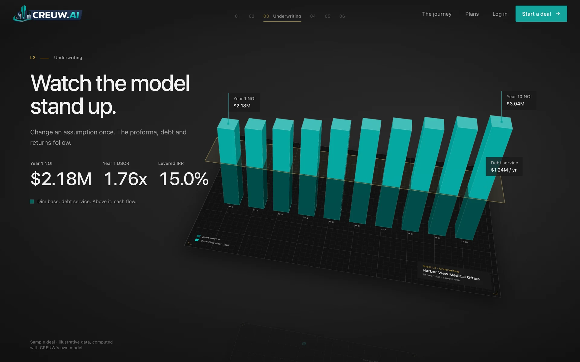
Kidsmania: Brand website and product catalogue
The website and product catalogue for a family-owned maker of interactive candy toys.
- Client
- Kidsmania
- Industry
- Consumer products
- Platforms
- Website, Broker portal
- What SOLOGEN did
- Brand and interface design
- Website and catalogue engineering
Why it matters
Kidsmania sells play as much as candy. The site had to feel the way the products do, and still work as a catalogue for the distributors who stock them.
Kidsmania began as a family plastics and toy business in the 1960s and turned to what it calls interactive candy in 1996: dispensers, games and gadgets that outlast the sweets inside them.
Its website has to serve a child looking for something fun and a distributor looking for a case pack, sometimes on the same page.
The challenge
Two very different audiences use one site. Families want colour, characters and something worth scrolling. Brokers and distributors want SKUs, specifications and assets they can download. More than a hundred products have to be easy to browse for both.
What we built
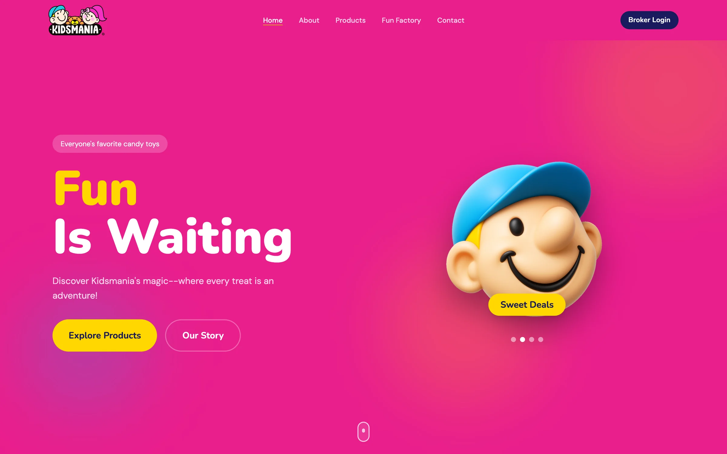
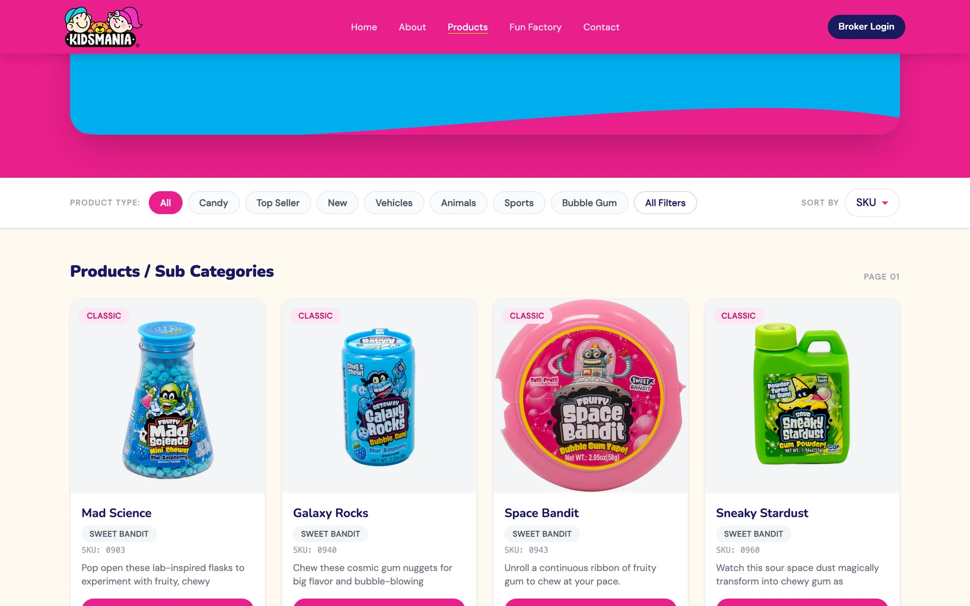
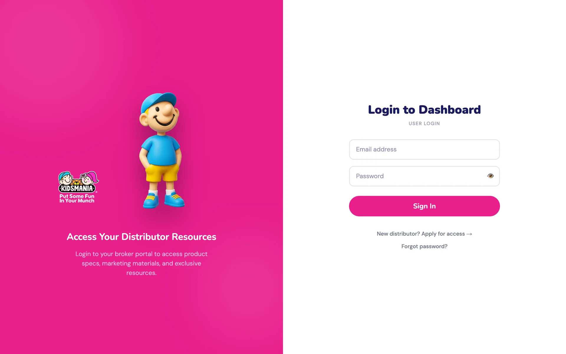
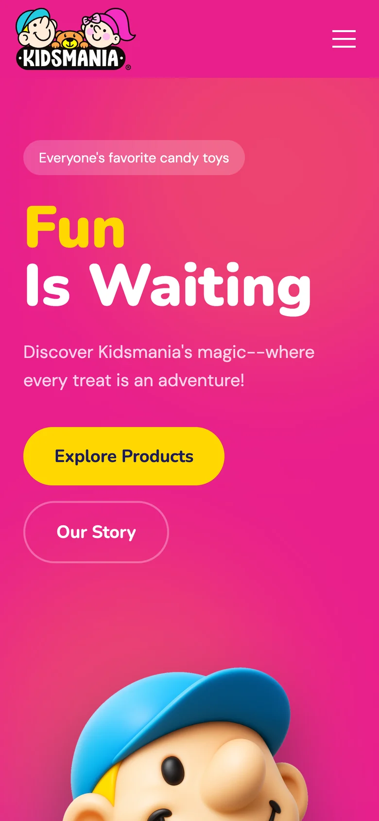
A brand site in hot pink, sky blue and sunshine yellow, with wave-cut sections and 3D characters, wrapped around a properly structured catalogue. Products filter by type. Each has its own page with claims, a full specification and similar treats. Behind a sign-in, a broker portal gives distributors specs, marketing materials and resources.
- Brand website
- Product catalogue
- Distributor portal
- 3D characters
- Brand storytelling
Two audiences, one site
Meet the brand
Characters, colour and the story of a family business built on play.
Find your fun
The full range, filtered by type: candy, vehicles, animals, sports, bubble gum.
Read the product
Claims, specification, SKU and similar treats on every product page.
Sign in as a broker
Full specs, SKU data and downloadable assets for distributors.
The product

What makes it interesting
A project that looks nothing like us.
SOLOGEN's own site is off-white and quiet. This one is hot pink, with a 3D bear. Good product design serves the brand in front of it, not the studio behind it.
What is in it
Filterable catalogue
Browse by product type or sort by SKU, with new and best-selling items flagged.
Product pages
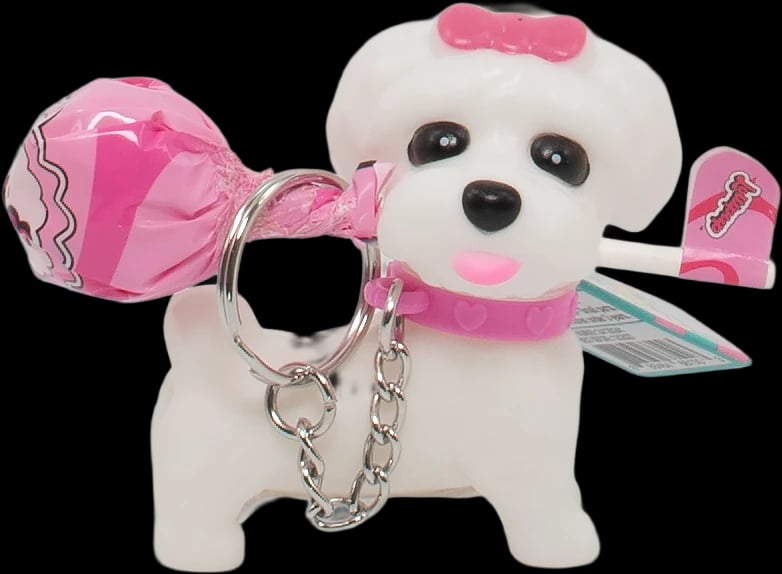
Photography, claims such as gluten free, a full specification and similar treats.
Broker portal
A sign-in for distributors, with an application route for new ones.
Characters in 3D
The brand's mascots as dimensional figures, not flat clip art.
A brand that moves
Wave-cut sections, carousels and a marquee that reads Put Some Fun In Your Munch.
What you can check
- Live site
- kidsmania.com
- Products
- 100+, as published by Kidsmania
- Audiences served
- Families and distributors
Technology that is publicly visible
- Next.js
- Firebase Storage
We list what anyone can verify. Results belong to our clients, so we do not publish numbers here that they have not published themselves.
How it looks, and why
Hot pink, sky blue, sunshine yellow and deep navy; rounded type; wave edges; glossy 3D mascots. Maximal on purpose.
Built with
- Web DevelopmentWeb applications, SaaS platforms and the systems behind them, engineered to stay fast and easy to extend.
- UI/UX & Product DesignResearch, flows, prototypes, interfaces and design systems, shaped alongside the engineers who build them.
- E-commerce softwareStores that are fast to shop and simple to run.